October sure flew by!
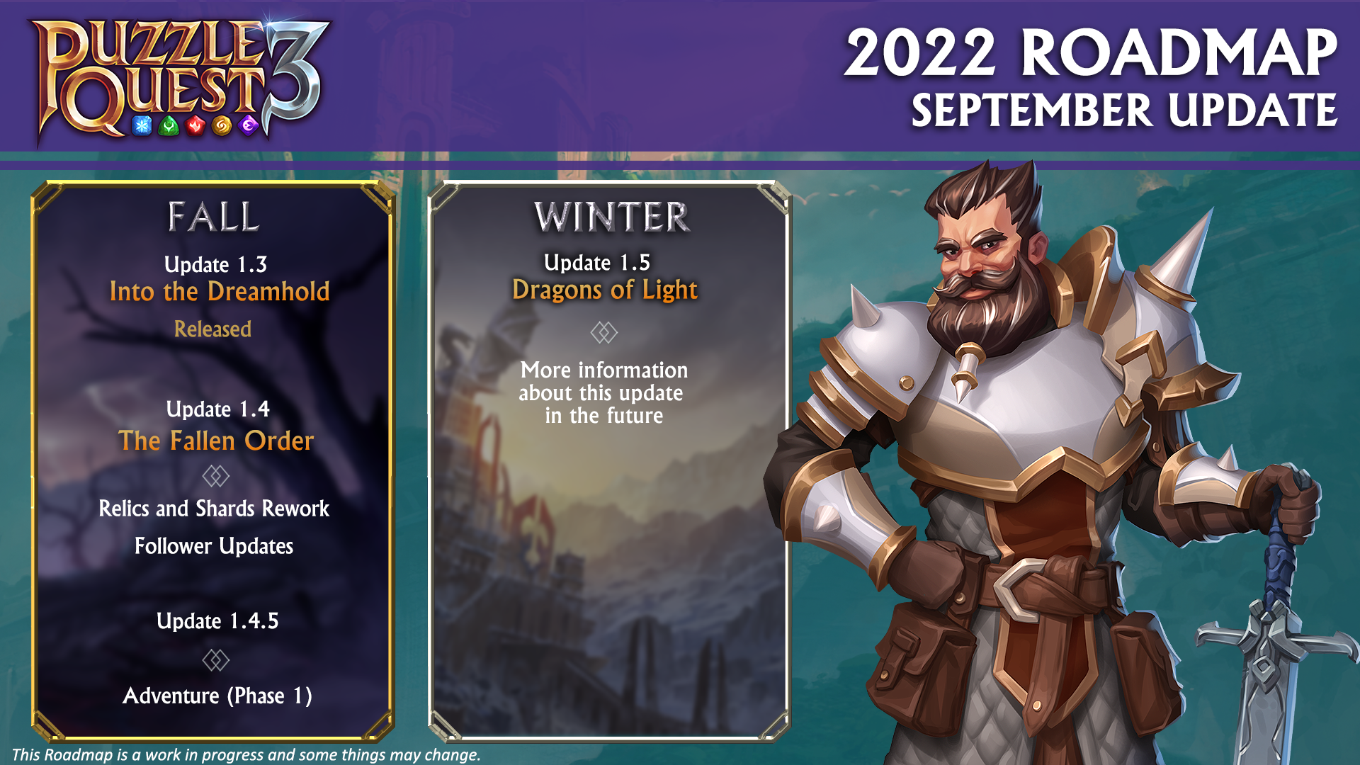
Since our last update, we intended for this community update to be released mid-month but as you can tell, this is a bit delayed! There isn’t a huge change in our 2022 Roadmap. But in case you forgot, here’s a refresher! ROADMAP – September
As mentioned, our 1.4 Update is being split into two parts. You can read more about that decision in our September Community Update.
Let’s talk about the things we can share since that September update! A few changes are coming and based on some of the buzz from our community channels, we can tell you’re excited. With Season 1.4 just days away, we’re excited for upcoming changes in 1.4 and further ahead.
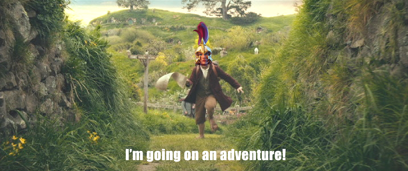
 Going on an Adventure!
1.4.5 BAYBEEEE! The team is super excited to get this one out to you.
So, we’ve teased it, but what is it?
Well, we’ve been taking a little inspiration from the original Puzzle Quest with this one.
You’ll learn the full details in the 1.4.5 Patch Notes, but the biggest thing we’d like you to know is…
Not every journey is a straight line and not every Adventure is either!
We will be bringing you branching pathways in Adventure!
Maybe you want to battle, or visit the merchant, or stop for Fae Gifts.
We’re very excited about Adventure and its potential for new game modes and Puzzle Quest experiences!
More to come. 👀
Pivot! Pivoooooot!
We have had the question come up in our community:
“How do you choose what to work on and when?”
This is a great question and we think it deserves the time for an answer from us. We would like to follow up with a more detailed dedicated explainer to give you a bit more insight into how we put things together.
But, for now, to give a bit of an idea…
We’re turning a ship, not a car.
We approach updates by determining what our long-term goals are for the game and what we can do to get closer to those.
We also need a reasonable lead time into updates because we do have to plan out big chunks of work and we need to make sure there’s design time ahead of that.
When we say “We’re always looking at and taking in your feedback” we’re absolutely sincere. We’re looking at your feedback as well as our data (and how we feel about the game too).
Where we go from there is working out either where we can slot those little quality of life items or, if several small pieces of feedback or trends are actually pointing to something bigger that might need a bigger solution.
With that said, let’s take a look at where we’re at with the feedback we got from the 1.3 UI updates!
Organization!
As you may have seen in our Patch Notes for 1.4, we’ve made some more changes to the Inventory UI based on some of your suggestions after 1.3. As you know we made a first pass of getting a few smaller changes in for the 1.3 hotfix. Now, we didn’t have time to implement everything this update, so we focused on a couple of things that we thought would have some bigger impacts for you folks:
- Adding a Detailed View so you can see more information about your items in the inventory and their names
- Updating the item borders to make the item rarity clearer (especially for spells) and adding the rarity colour to the ribbon on the icons
- Changing the upgrades flow so Max Rarity is no longer the default
- Adding additional Vault Filters for Rarity and Gear Set
- How do we better show information for Attributes and Gear Sets?
- How do we show more information about items being Salvaged?

